Scanner Pro has lived on the App Store since 2009, long enough to grow from a simple scanning app into a genuinely complex professional tool, with more features than most users will ever explore. That kind of maturity is a strength, but the team wanted to ensure that although it is a serious professional tool, it still feels welcoming and human.
Scanner Pro's recent global redesign set out to close that gap.
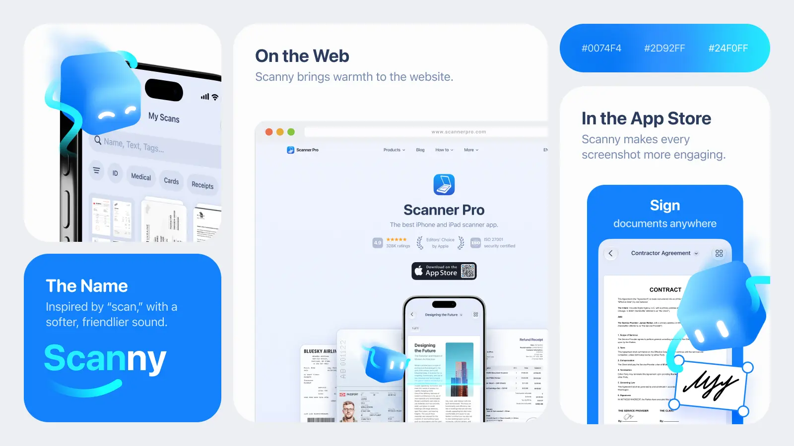
One of its quieter decisions turned out to be one of its most visible: Scanny, a small blue cube built from light, who now lives inside Scanner Pro's world.
We spoke with Halyna Voloshanenko, Design Lead at Readdle, about how Scanny came together.
Building connections with the users
The brief behind Scanny grew naturally with the redesign. "The main goal was to increase brand awareness and strengthen the emotional connection with the user during the global redesign," Voloshanenko says. "We wanted to refresh communication with our users. Through a mascot, it is much easier to convey marketing messages and attract a new audience."
Scanner Pro's age made this even more challenging.
Nearly two decades after launch, the app has grown well past basic scanning into a feature-dense professional tool: powerful, but not always easy to warm to. "We wanted to make this complex pro-product easier to perceive, more emotional, and more human," she explains. "That desire sparked both the redesign and the search for a way to add emotion to the app. We realized that a mascot would help us with this. It doesn't reinvent the product itself, but makes it much more welcoming."
As the team defined it, the job was specific: make the interface easier to step into, and turn new releases into something that feels like being shown around instead of handed a changelog.
How Scanny came to be
The team didn't arrive at Scanny quickly. "In total, we created four full-fledged concepts," Voloshanenko says. "We settled on the fourth one because it best conveyed the essence of our technology without drawing unnecessary attention to itself. This direction perfectly suited the product: clean, modern, and minimalistic."
Before any of those concepts existed, the team looked outward. "We researched the market: we looked at the Duolingo owl, the Monobank cat, and the characters of Headspace and Gentle Streak," she says. They wanted to understand the different roles a mascot can play before deciding which one fit Scanner Pro. "We were interested in analyzing exactly where a mascot is used, what its role is in the product, and in what communication channels it lives.
In many of these apps, the entire branding is built around the character. We, on the other hand, were looking for our own perfect balance, where the mascot plays a supporting role and only subtly complements the serious interface of our tool."
What Scanny actually is
Ask Voloshanenko to describe Scanny in a few words, and she reaches for calm over cute: "Scanny is about calmness, reliability, modernity, and gentle guidance." Every visual choice was made to look appealing and carry one of those traits.
The rounded cube shape was chosen for approachability. "To make strict technology more human, we chose a minimalistic shape but abandoned sharp corners," she says. "These soft roundings turn a regular cube into a welcoming and helpful assistant, and also visually echo the shape of icons on the iPhone home screen." The deep blue color, meanwhile, does the opposite work, keeping Scanny tethered to a serious tool. "To maintain the feel of a serious pro-tool, we used a deep blue. This is a direct continuation of our visual style, which works to build user trust."
Scanny's one real expressive tool is light. "His main interaction tool is a beam of light," Voloshanenko explains. "On the one hand, this is a direct and clear metaphor for the scanning process itself. On the other hand, that soft glow is how he shows he cares: visually telling you he's looking after your documents and helps make your work routine easier."
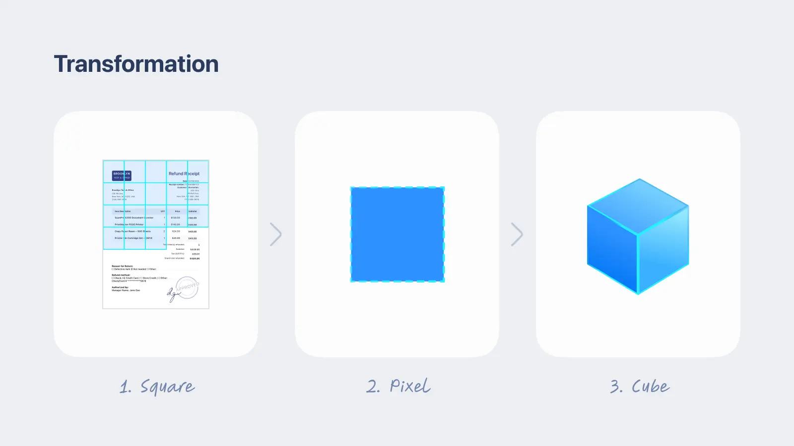
Even his backstory ties back in to the product. "The process of scanning and enhancing an image happens step by step, pixel by pixel," she says. "Therefore, Scanny originated as a regular flat pixel, which later came to life and transformed into a volumetric, dynamic cube."
What the team left out mattered as much as what they kept.
Scanner Pro's audience skews toward adult professionals, 30 and older, and that shaped the guardrails from the start. "We tried to avoid excessive childishness, cartoonishness, and over-expressiveness," Voloshanenko says. "In order not to turn working with documents into entertainment and to maintain trust in a serious tool, we abandoned classic anthropomorphism: arms, legs, complex facial expressions."
From a Crazy 8s brainstorm to a Figma and Rive
The path to that final cube ran through three distinct stages.
First came research, mapping where competitors used mascots and which of Scanner Pro's own touchpoints could support one, which set the technical constraints and criteria for the search that followed.
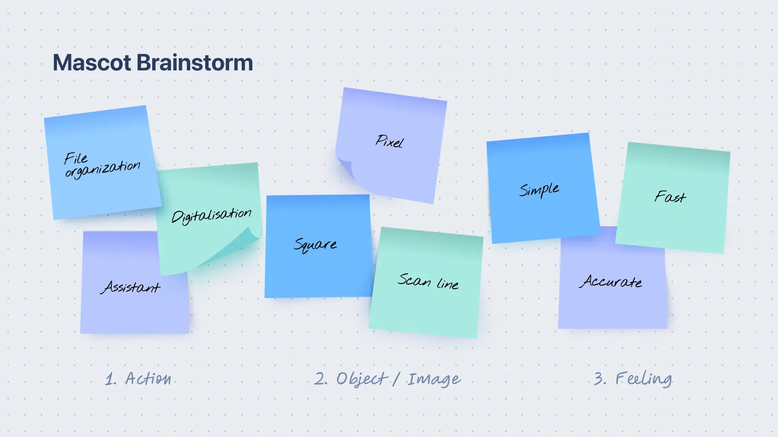
Then came brainstorming: the team gathered its own associations with scanning, ran a Crazy 8s session to generate ideas fast, and scored the results against criteria like brand connection, UI suitability, motion potential, and adaptability for campaigns. Three directions survived that filter.
The final stage belonged to the design team.
"Our marketing designer Anya did an amazing job," Voloshanenko recalls. "She took each of the three selected directions, created a concept, and presented it to the team.
During the presentations, we collectively discussed each option, breaking down all the pros and cons." Rather than a single winner emerging outright, the fourth concept was assembled from what worked best across all three. "There were no sharp pivots; it was rather a process of evolution," she says. "After working through the first three concepts, we realized that none of them individually was perfect. So we just took the most successful solutions from all three iterations and combined them."
The hardest call, by her account, had less to do with which concept to pick than with how much detail Scanny should carry. "We were looking for a fine balance: to create the simplest possible shape that would be easy to animate and wouldn't overload a serious UI, but at the same time would have its own character and not look boring."
Early sketching happened by hand during the Crazy 8s session, but everything after moved to Figma, with Procreate for quick exploration.
The bigger constraint came once the motion team got involved: Scanny is built to eventually run as an interactive Rive animation on the app and website and Rive can render effects, like gradients and complex glow, that don't reliably survive translation from a Figma mockup. "The main constraint was to use only those effects and visual solutions in Figma that the motion designer could 100% accurately replicate during animation, ensuring the character looked the same everywhere," Voloshanenko says.
That meant testing and adapting details like the beam's glow and the soft transitions of shape, so they held up consistently, including across both light and dark UI modes.
A real cross-functional project
Scanny wasn't built by the design team alone. "We had a cross-functional team: head of product, product managers, product designers, and myself as the design lead," Voloshanenko says. "We also involved the company's creative designers and an independent consultant to get a fresh outside perspective."
Given how many people had a stake in the outcome, the process was notably free of conflict. "There were no serious or heated disagreements," she notes. "Because we clearly set the constraints and agreed on the metaphors from the very beginning, the team shared a common vision. Internal feedback helped us rather to polish details, not to change the overall course."
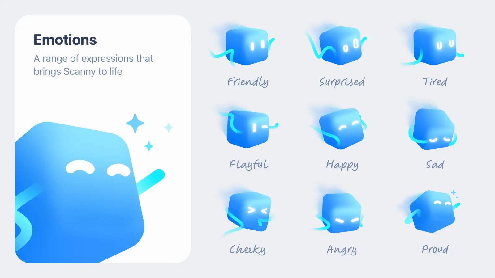
Before finalizing Scanny's emotional range, the team took him out of the building and tested him with actual users, on real App Store screenshots and marketing creatives. "We tested the mascot on App Store screenshots and marketing creatives," Voloshanenko says. "The tests showed a positive result, confirming our hypothesis. Only after that did we move on to the final refinement of his emotions and additional states."
The name, and where he shows up first
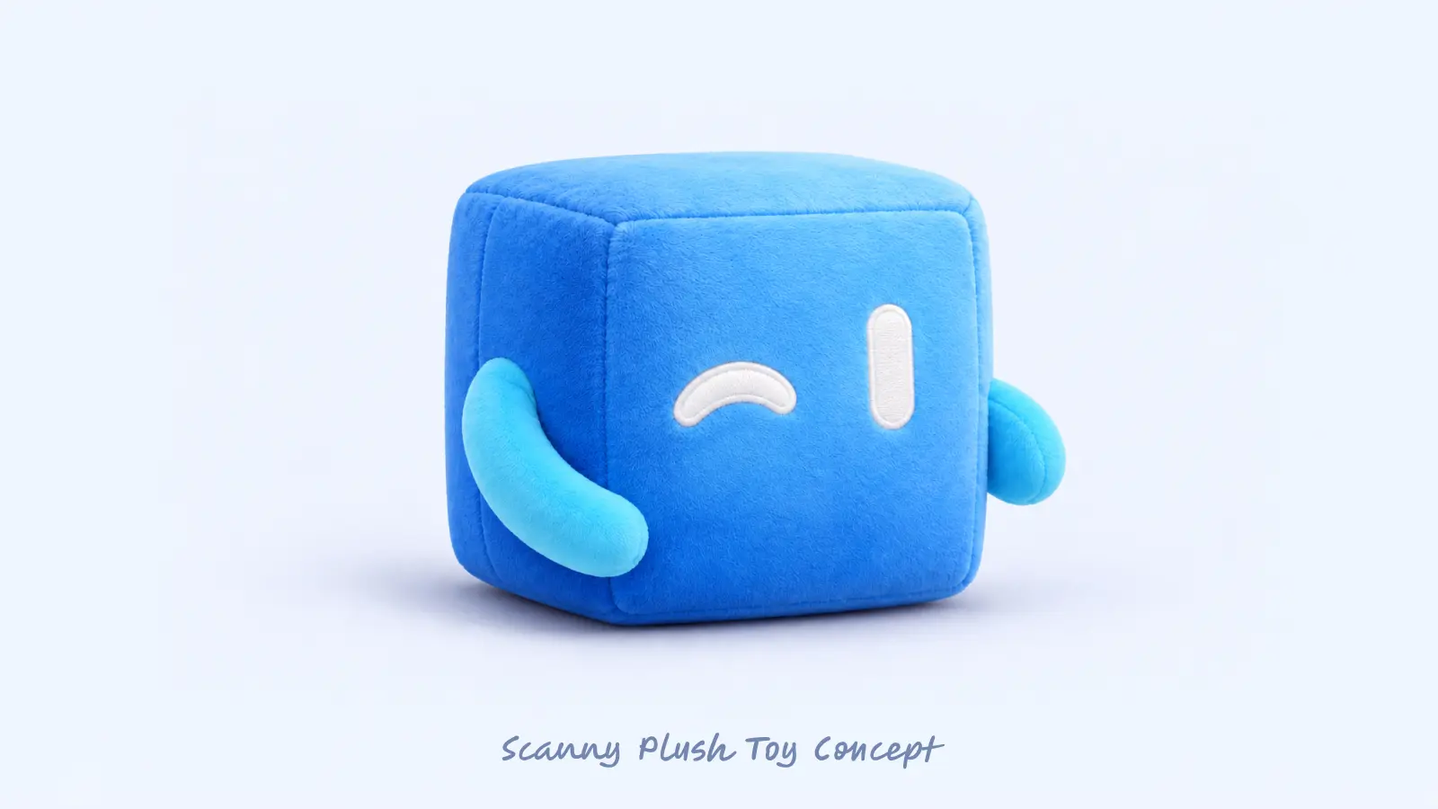
The name is almost too simple to overthink. "The name Scanny comes from the word scan, but it sounds soft and friendly, emphasizing his role as a welcoming assistant," Voloshanenko says.
Internally, the reaction has been enthusiastic. "The team is thrilled," she says. "Scanny perfectly highlights our updated vision and UI. He wonderfully balances the product: Scanner Pro remains a professional tool, but now it feels much more welcoming and human."
Readdle is rolling him out gradually, one placement at a time. "We opted for a gradual rollout strategy so as not to overwhelm users during the redesign," Voloshanenko says. Scanny will appear first on Scanner Pro's website and in App Store screenshots, then move into the product itself, starting with paywalls and expanding from there. The team is keeping some of it under wraps: "We are not revealing all the details just yet, as we want to pleasantly surprise our users."
Looking back, Voloshanenko is proudest of what the team chose not to do. "I am most proud of the fact that we didn't go the route of classic mascots with faces and facial expressions, but were able to convey character exclusively through the clean shape of a 3D cube and the dynamics of light," she says. "Scanny turned out exactly as we intended: subtle. He doesn't pull attention away from working with documents, but rather very organically complements the interface."
If she could redo one thing, it wouldn't be a design decision. "I would probably advise my past self: multiply your initial time estimate by at least three," she says. "At the start, it seemed that creating a character was a pretty straightforward process that we would easily close. But, as often happens in design, making something truly simple and understandable is the hardest task."
What she hopes people feel is, in the end, simple too. "I hope that when users see Scanny in the app, in ads, or on the website, they will recognize the scanner technology itself in him: smart, fast, and understandable," she says. "We want the mascot's smooth movements and his soft glow to make interacting with the app more lively while working with documents."
Scanny is already live on Scanner Pro's website and in its App Store screenshots, with more of the app to come. Keep an eye out: he's on his way in.