Every couple of years, Apple ships a change that makes every app on your phone and iPad feel like it needs a second look. iPadOS 26 was one of those moments: it introduced Liquid Glass, Apple's new translucent, light-bending design language, and finally brought real Mac-style windowing to iPad.
Now, with iOS 27, which lands today on September 14th, Apple is going even further, refining Liquid Glass for better readability and contrast (with a new slider to dial the effect from ultra-clear to fully tinted), and pushing more of its own apps to work properly in flexible layouts and landscape orientation.
In other words, the way apps look and behave on your devices is shifting, and we've spent the last stretch of development making sure Calendars isn't just along for the ride, but genuinely at home in it.
What we've been building
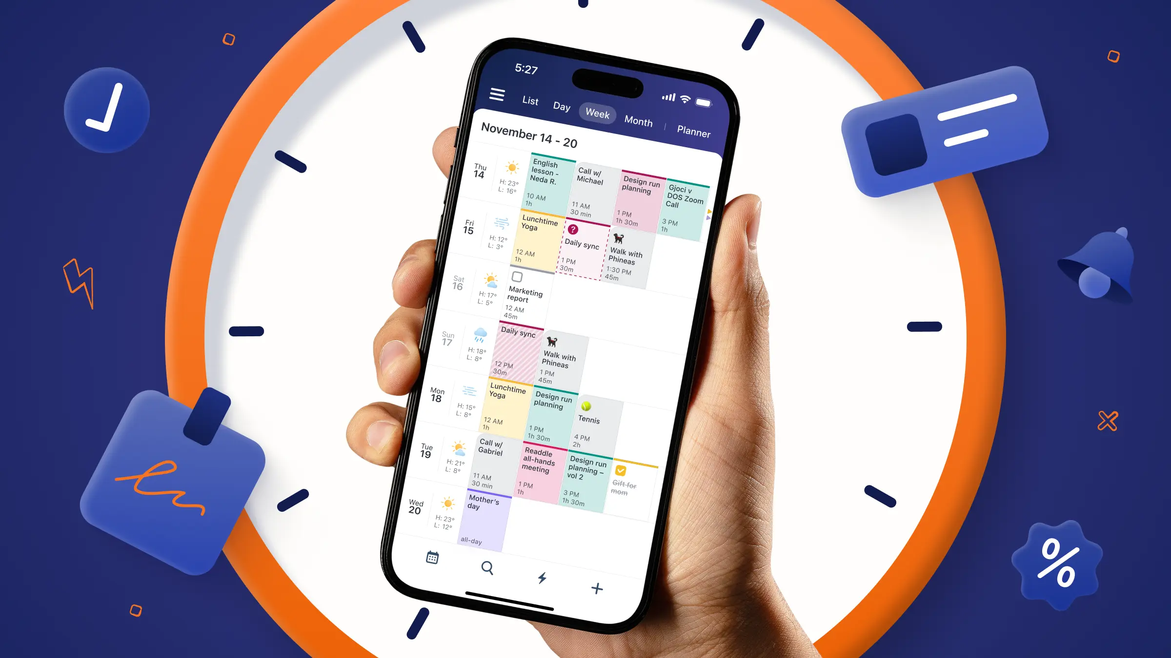
The biggest change on our end is one you'll feel before you even notice it: Calendars now adapts more naturally to whatever size window you give it. Split View, Stage Manager, Slide Over, a resized window on a bigger iPad: instead of layouts breaking or forcing you back to full screen, panels, cards, and editors reflow live to fit the space you actually have. Calendar apps have historically been the first thing to look awkward in a resized window. We wanted ours to be the exception.
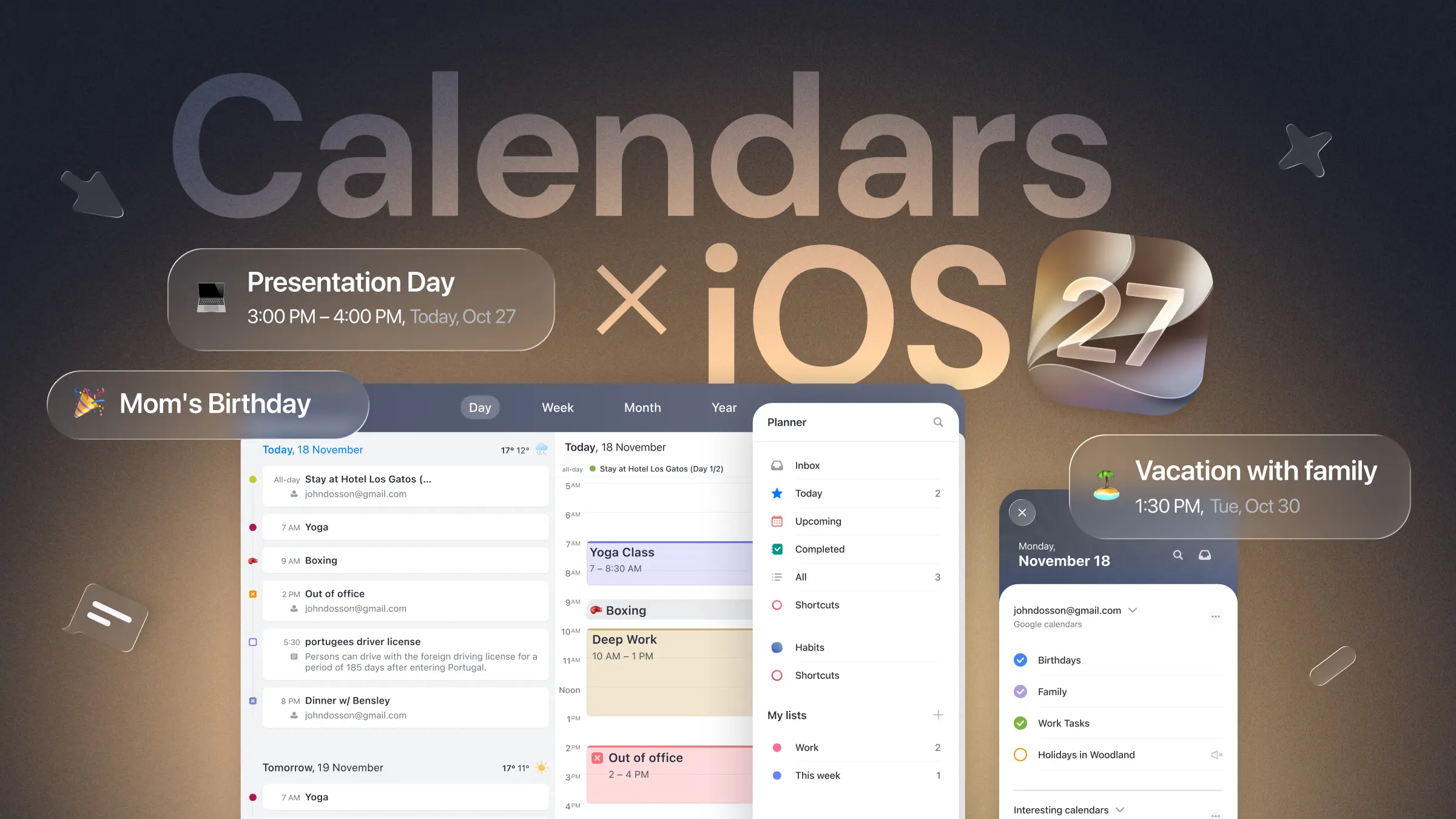
That same shift opens the door for something a lot of you have asked for: Planner as a side panel. On wider layouts, your task list no longer takes over the whole screen: it sits alongside your calendar, so you can plan your day and glance at your schedule at the same time instead of bouncing between tabs.
We've also rethought how the rest of the app presents itself.
Things like Settings, Search, Shortcuts, and your event and task details now open in a way that feels consistent whether you're on an iPhone in your pocket or an iPad on a stand, the same app behaving as if it belongs on both.
And yes, Day, Week, Month, and Year views, along with top navigation, notification center and Quick Scheduler, are getting a cleaner pass to match.
Then there's the look. Calendars is adopting Liquid Glass itself, with a graceful fallback for anyone not yet on iOS 26 or on pre-iOS 26 devices, so the app picks up Apple's new material and feel without leaving anyone behind.
Why we're excited
None of this is just cosmetic. Apple is clearly betting that the iPhone and iPad of the near future are more flexible, more multitasking-friendly, and more "computer-like" than ever, and that means the apps people rely on every day need to be rebuilt with that flexibility in mind, not bolted onto it after the fact.
Calendars has been part of people's daily routines for a long time, and updates like this are exactly why: they're a chance to make the app feel newer, more flexible, and more useful, right as the platform itself levels up.
For now: get ready, because Calendars is about to feel different, in a good way.