Remember when your school planner or notebook wasn’t just a place to write things down, it was something you designed? Blue for one subject, pink for another, maybe a highlighter for anything important. If you were really committed, you added headers, doodles, or a colour key in the corner. At the time, it probably felt like a creative outlet and maybe even a way to procrastinate a bit.
But it turns out, your younger self was onto something. Colour coding is actually one of the fastest ways to help your brain recognize and process information.
What is colour coding?
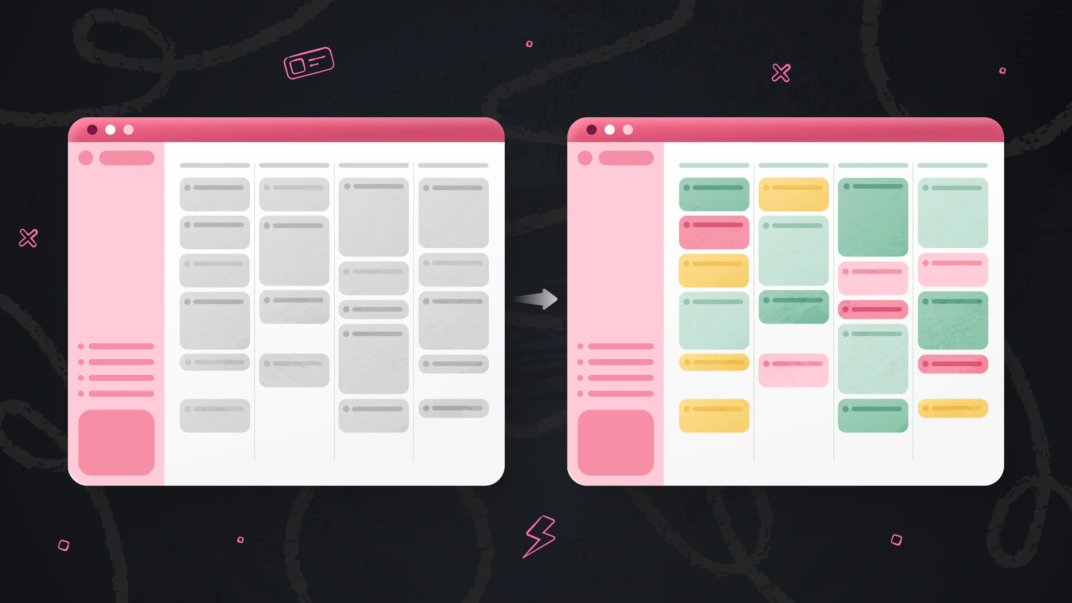
Colour coding is a way of organizing information by assigning different colours to different categories, types, or priorities. It creates a visual system that helps you quickly understand what you’re looking at without having to read every detail.
Instead of processing information line by line, your brain can group things by colour, which makes it easier to scan, compare, and spot patterns. This is especially helpful when you’re managing multiple types of information at once.
There’s also a reason it feels so intuitive. Humans naturally respond to visual cues, and colour is one of the strongest signals we use to sort and make sense of the world around us. That’s why it felt so natural as a kid. Colour helped you focus, remember, and feel more in control of what you were managing. And it still works the same way now.
Why is colour coding your calendar so beneficial?
1. It reduces cognitive load
When information is uniform (for example, a calendar where every event looks the same), the brain must actively interpret and categorize each item before it can be understood. This increases cognitive load, the amount of mental effort required to process information. Research in cognitive psychology shows that adding structured visual cues, like colour, helps offload this processing demand by enabling pre-attentive grouping. In other words, the brain can recognize categories instantly rather than consciously working through each item, freeing up working memory for decision-making and focus.
2. It directs attention automatically
Colour organizes information and, most importantly, guides where you look first. Eye-tracking studies show that color acts as a “salient cue,” meaning it naturally draws attention before conscious decision-making kicks in. In one controlled study published in MDPI (Multidisciplinary Digital Publishing Institute), participants made significantly more return eye movements to colour-highlighted information, showing that colour increased attention and focus on key areas without requiring effort.
3. It makes switching between tasks easier
Switching between different types of tasks comes with a real mental cost. Research on task switching shows that the brain must actively “deactivate” one task set and “reconfigure” another, which relies heavily on working memory and executive control. This switching process slows performance and increases errors.
In practical terms, that means every time you shift from one kind of work to another, your brain pays a small “reset cost.” Visual structure (like colour coding) helps reduce that friction by letting your brain instantly recognize context, so it doesn’t have to fully reorient each time.
How to colour code your calendar
There’s no single “right” way to color code your calendar. The most effective systems are the ones people naturally build around their real lives, responsibilities, and ways of thinking. Here are a few real-world approaches from Calendars by Readdle users, plus how you can set them up yourself.
1. By people or recurring relationships
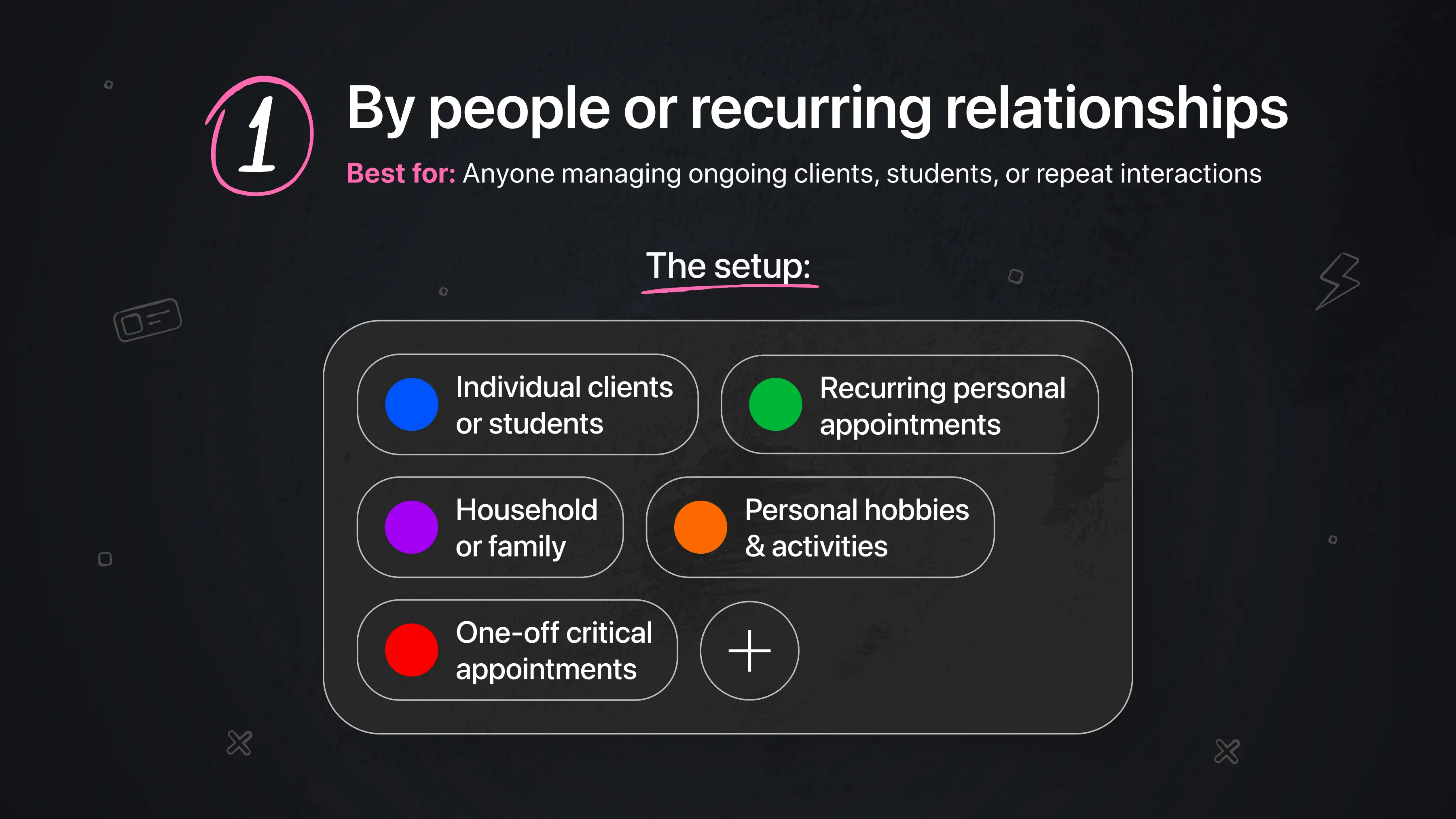
Best for: Anyone managing ongoing clients, students, or repeat interactions.
This system works well when your schedule is built around specific people or repeating relationships, because it turns a busy calendar into something instantly recognizable.
One user describes building an entire life system around this approach:
“I am a Clinical Psychologist in private practice. Clients are all the same color and listed in their time slots for their sessions. Then I use the various colors for all my other appointments and personal reminders. I love all the various color options as I love color, and using different colors for different personal appointments and events is very helpful for me. My dog has her own color, so any appointment or reminder having to do with her is in HER color. My swimming regimen has its own color. My needlepoint hobby has its own color. Lunches have their own color. Even doctor appointments have their own color. And when I have an appointment to donate blood – it goes in as full red.” — Laureen Light
For her, colour becomes a way to distinguish between repeating responsibilities and personal life at a glance without having to read each entry.
The setup:
-
🔵 Individual clients or students
-
🟢 Recurring personal appointments (like wellness routines)
-
🟣 Household or family-related commitments
-
🟠 Personal hobbies or long-term activities
-
🔴 One-off critical appointments (medical, time-sensitive events)
2. By role or life context
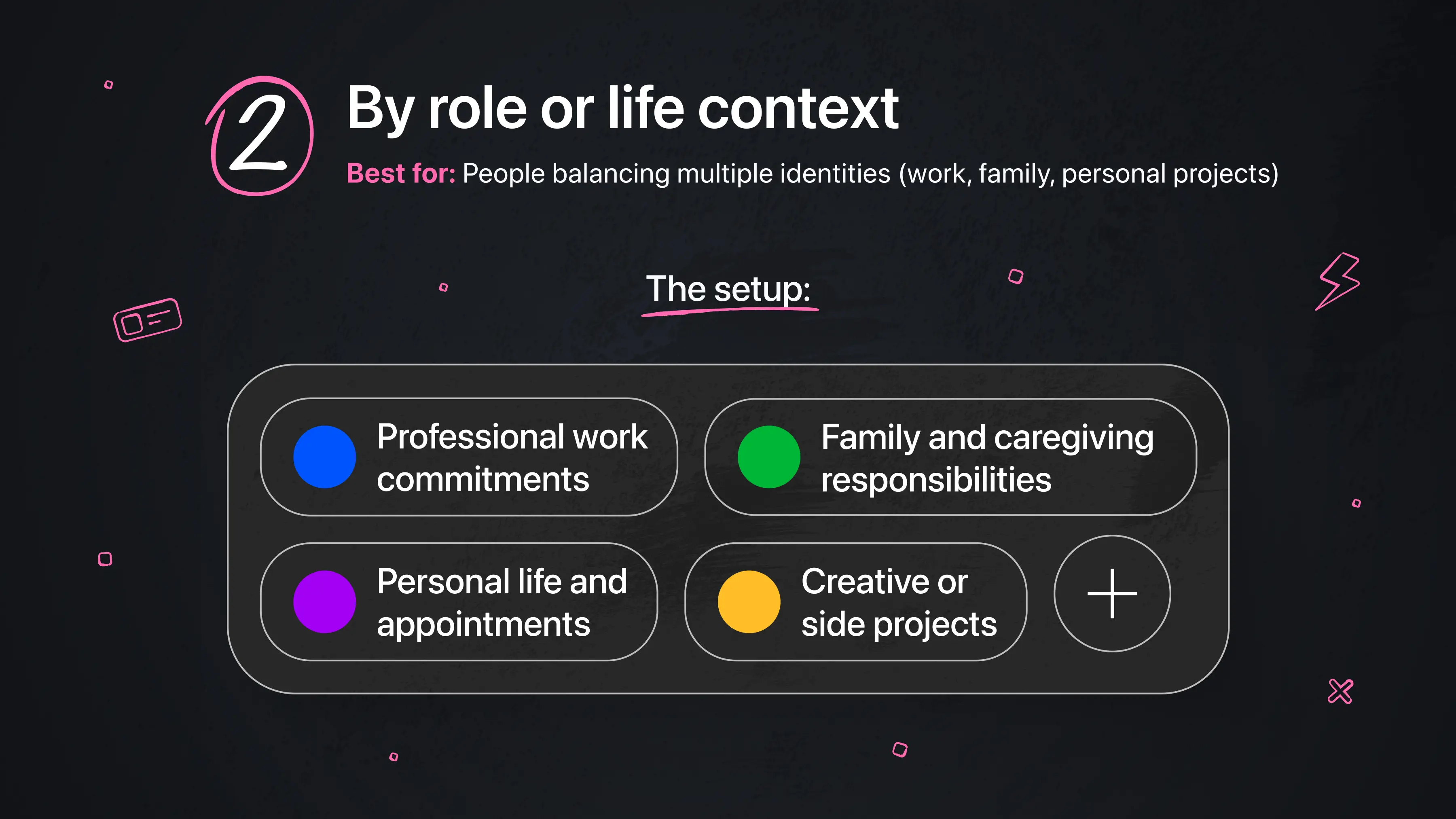
Best for: People balancing multiple identities (work, family, personal projects)
This system separates your calendar by the different “hats” you wear in a day.
For some users, this clarity is what makes switching between roles manageable:
“My top productivity tip/trick: Custom color-coding! I love that Calendars lets me pick any custom color I want for each calendar, whereas the native iOS calendar app only offers a limited default palette. Because of this, I'm able to use our exact agency brand colors for my work calendar, and distinct, easily identifiable colors for my family and personal calendars. A quick glance tells me exactly what context an entry belongs to without even having to read it.” — Justin Marshall
Here, colour acts as a mental switch, helping the brain instantly understand which version of life it’s in.
The setup:
-
🔵 Professional work commitments
-
🟢 Family and caregiving responsibilities
-
🟣 Personal life and appointments
-
🟡 Creative or side projects
3. By urgency and importance
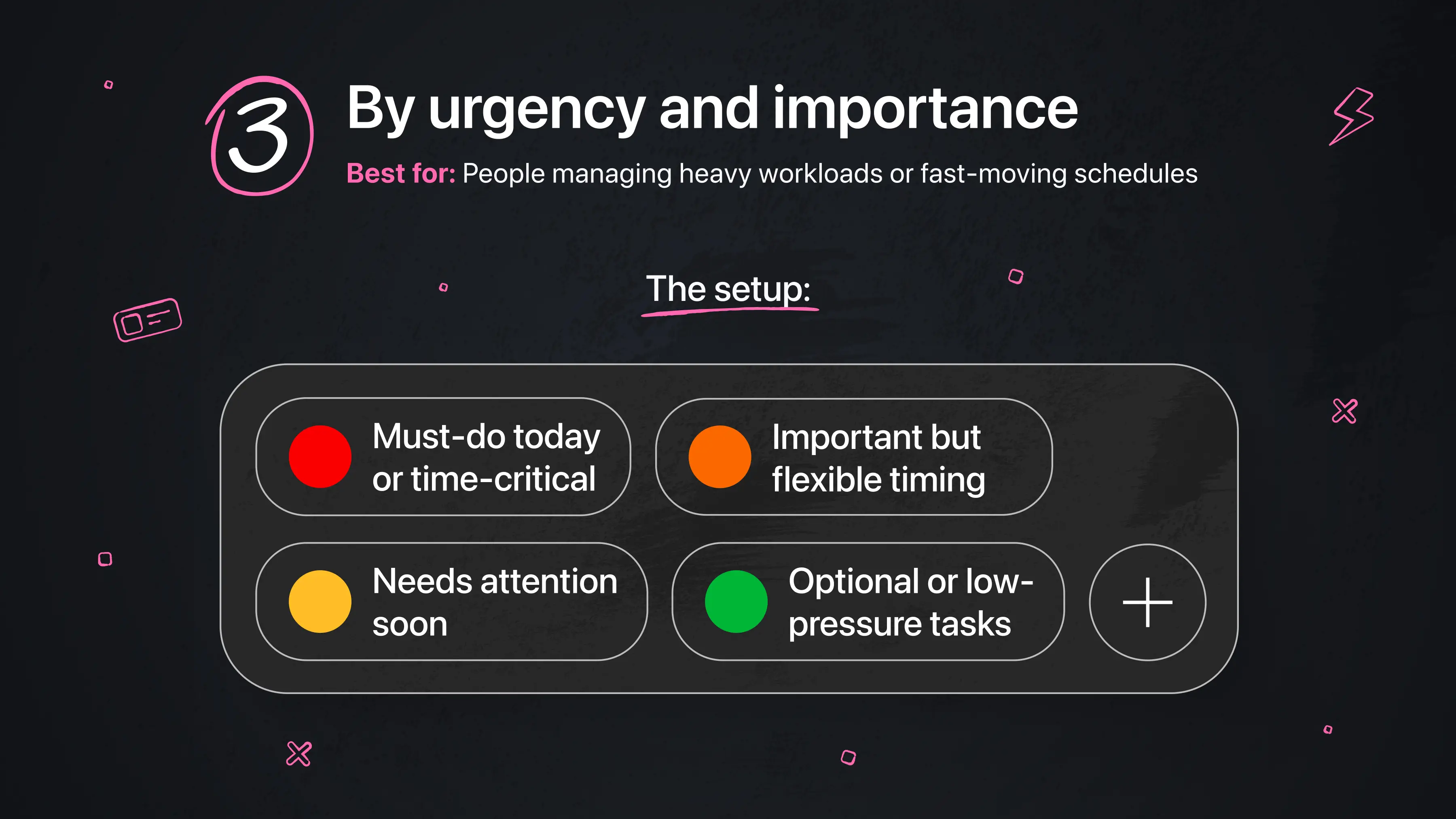
Best for: People managing heavy workloads or fast-moving schedules
This system turns colour into a decision-making shortcut. Instead of scanning a long list of events, users can instantly see what needs attention first.In this case, colour is prioritization made visible.
As one user explains:
“I love the enhanced colour coding that makes the application all the more helpful to highlight the most important tasks in a relevant colour.” — Keith A. Barlow
The setup:
-
🔴 Must-do today or time-critical
-
🟠 Important but flexible timing
-
🟡 Needs attention soon
-
🟢 Optional or low-pressure tasks
4. By mental load or energy type
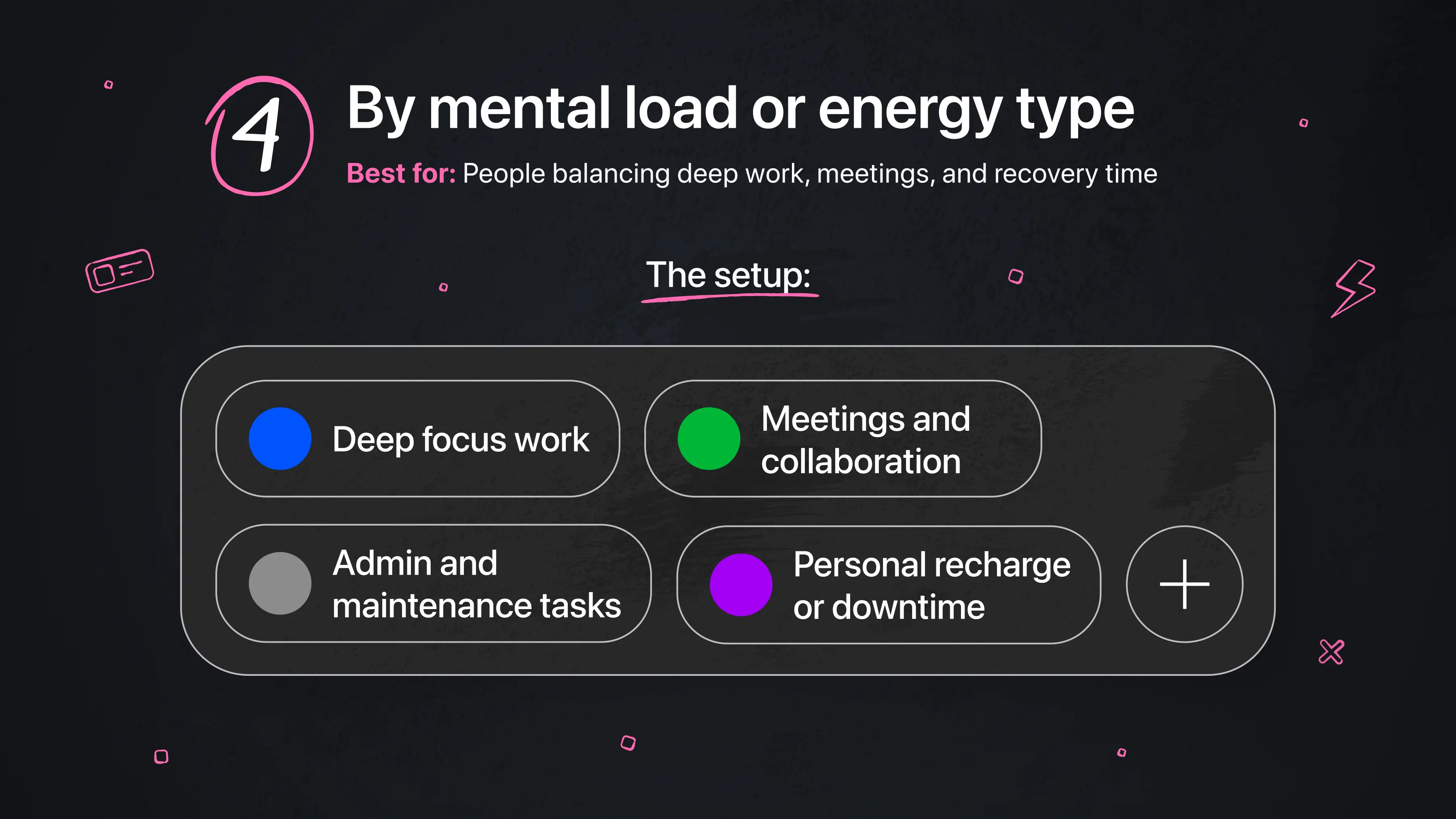
Best for: People balancing deep work, meetings, and recovery time
Some users structure their calendar around how much energy each activity requires. This becomes especially useful when life is full and varied. Here, color helps reduce mental overload by making different types of time instantly distinguishable.
The setup:
-
🔵 Deep focus work (high concentration, no interruptions)
-
🟢 Meetings and collaboration (shared attention)
-
⚫ Admin and maintenance tasks (low effort, routine work)
-
🟣 Personal recharge or downtime
Try it for yourself
If you’ve made it this far, here’s the real question: what would your calendar look like if you could understand it at a glance?The only way to find out is to build your own system.
Start by downloading Calendars by Readdle, then take a few minutes to set up a simple colour coded structure. You don’t need to overthink it. Just begin with a few categories that matter most to you.
Here’s how to get started:
-
Create or review your existing calendars (work, personal, etc.)
-
Assign a distinct colour to each one.
-
Add or update a few upcoming events using those colours.
-
Step back and look at your weekly view. Can you understand your schedule without reading every detail?
That’s the goal. You can always refine your system over time, but the biggest shift happens the moment your calendar goes from something you have to read to something you can see.
Frequently asked questions
What if I have too many colours?
Having too many colors usually means the system is becoming harder to read instead of easier. When every category has its own color, the structure starts to break down and your calendar can feel visually overwhelming. A helpful guideline is to stick to around 6–8 core colors so your brain can still quickly recognize patterns without having to decode too many variations.
What if I forget to colour code my events?
Instead of relying on manual updates every time, it helps to set default colors for your main calendars so events are automatically categorized as you create them. From there, you can do a quick weekly review to clean up anything that wasn’t categorized properly, so the system stays consistent without requiring constant effort.
What if colour coding feels like extra work?
If colour coding feels like another task instead of something that makes your calendar easier to use, the system is probably too complex. In that case, simplifying to 3–4 core colors can make a big difference. If even a simplified version still feels like maintenance, it may not be the right approach for how you naturally organize your time and that’s completely okay.
What if my categories don’t fit my real life?
This often happens when the system is built around an ideal version of your life rather than your actual day-to-day reality. When that happens, the colours stop feeling intuitive and start feeling forced. The best approach is to rebuild your system based on how your life actually looks right now, not how you think it should look. Effective colour coding reflects real patterns in your schedule, not perfect or theoretical ones.


